ShopDreamUp AI ArtDreamUp
Deviation Actions


Comments54
Join the community to add your comment. Already a deviant? Log In
Hello, I'd like to leave you a few words about my impressions of this painting. Please remember that those are my own opinions and observations and as the author you are the one to judge whether they fit with your style.
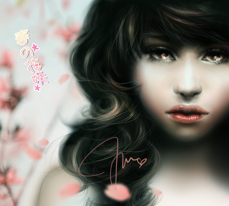
Now, I understand that the combined number of stars I give you for this deviation is quite low but I want to assure you that I really like the work. It looks very elegant and soft and feminine, on which I congratulate you. I would assume that this is the look you were going for so you've definitely achieved your aim.
Well, firstly, I gave you only half the marks impact because I cannot really see what you're trying to impress upon the viewer. I'm not sure if it's just a simple portrait with no other idea behind it or if there's more to it. Apart from the initial reaction how beautiful it looks, it didn't really move me. Personally I think the idea of spring could be enhanced even further by adding, say, a flower in her hair. The blur of the petals creates very nice depth but you need a bit more detail on at least one or two petals to make them stand out and emphasize the theme. Her eyes on my opinion, being the most detailed part and therefore, I'm guessing, the central point, go particularly well with the theme as they are both very dreamy and very beautiful. I'd like to personally congratulate you on getting them so well. <img src="e.deviantart.net/emoticons/c/c…" width="20" height="20" alt="
I only gave you two for originality because... well, I guess you could see why. It's a fairly simple portrait with little innovation. This of course, doesn't prevent it from being a delight for the eyes. I can see that you were going for something more casual, something which looked attractive.
As far as technique is concerned, I quite like your style. It's a bit rough but you've managed to guide the attention of the viewer very well through the amount of detail. The colour palette is very suitable for the theme and I like that you've included some blues to make the pinks stand out. One thing I'd like to point out to you are the lips. While the form is very well defined, the line between the two lips is too thick and too dark. You should instead define it very lightly and thinly and for the rest of the darkened area use a dark pink shade, w bit lighter from what it is now. I like the detail you've put on the lower lip but it'd be better if there was as much to the upper one as well. I feel as if you've neglected it a little. In comparison, I think the hair is just perfect. You've defined its form very clearly, the shading is very nice and you've managed to add considerable detail for it being so dark.
All in all, this is a very appealing image with few mistakes and a lot of positive sides to build on. I wish you to continue to develop and create increasingly complex images with just as much beauty.
Kind regards,
Daniela